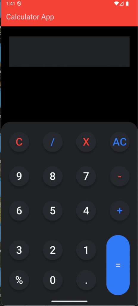
If you are learning Flutter state management, a calculator app is one of the best beginner projects. In this tutorial, we will build a Flutter Calculator App using Provider for state management. This app demonstrates clean UI, separation of concerns, and modern Flutter practices.
Whether you’re a beginner looking for a guided project or an experienced developer brushing up on Flutter Provider examples, this tutorial will walk you through the code and project structure.
Why Choose Provider for Flutter State Management?
Flutter offers multiple state management solutions, but Provider is one of the most popular due to its simplicity and scalability.
- It separates UI from business logic.
- Provides efficient state updates.
- Works perfectly for apps like calculators where the UI must react instantly to changes.
Project Structure
Our Flutter calculator app is organized into multiple files for better readability:
main.dart→ Entry point of the app.home_screen.dart→ Main calculator screen with UI.calc_provider.dart→ Business logic & state management using Provider.widget_data.dart→ Holds the button data (numbers & operators).calc_button.dart&Button.dart→ Custom button widgets for reusability.textfield.dart→ Custom styled text field for displaying results.colors.dart→ Centralized color constants for consistent design.
This structure keeps the code clean, modular, and easy to maintain.
Step 1: Setup Provider in main.dart
The entry point wraps the app inside a ChangeNotifierProvider so that the CalcProvider can be accessed anywhere in the widget tree.
void main() {
  runApp(
    ChangeNotifierProvider(
      create: (_) => CalcProvider(),
      child: MyApp(),
    ),
  );
}
This ensures the calculator’s state (numbers, operations, result) is globally accessible.
Step 2: Creating the Calculator Provider (calc_provider.dart)
The CalcProvider handles all calculator logic like addition, subtraction, clearing input, and updating the result.
class CalcProvider extends ChangeNotifier {
  String _input = "";
  String _output = "0";

  String get input => _input;
  String get output => _output;

  void addInput(String value) {
    _input += value;
    notifyListeners();
  }

  void clear() {
    _input = "";
    _output = "0";
    notifyListeners();
  }

  void calculate() {
    try {
      _output = _evaluateExpression(_input);
    } catch (e) {
      _output = "Error";
    }
    notifyListeners();
  }
}
This makes the calculator responsive — every change in logic instantly reflects in the UI.
Step 3: Designing the Calculator UI (home_screen.dart)
The HomeScreen builds the calculator layout with buttons and display fields.
@override
Widget build(BuildContext context) {
  final calc = Provider.of<CalcProvider>(context);

  return Scaffold(
    backgroundColor: AppColors.background,
    body: Column(
      children: [
        CustomTextField(value: calc.output), // result display
        Expanded(
          child: GridView.builder(
            itemCount: buttonData.length,
            gridDelegate: SliverGridDelegateWithFixedCrossAxisCount(
              crossAxisCount: 4,
            ),
            itemBuilder: (context, index) {
              return CalcButton(
                text: buttonData[index],
                onTap: () {
                  calc.addInput(buttonData[index]);
                },
              );
            },
          ),
        ),
      ],
    ),
  );
}
Here, the GridView dynamically creates calculator buttons using widget_data.dart.
Step 4: Creating Reusable Widgets
✅ Custom Buttons (calc_button.dart):
Reusable button with customizable design.
class CalcButton extends StatelessWidget {
  final String text;
  final VoidCallback onTap;

  const CalcButton({required this.text, required this.onTap});

  @override
  Widget build(BuildContext context) {
    return ElevatedButton(
      onPressed: onTap,
      child: Text(text, style: TextStyle(fontSize: 22)),
    );
  }
}
✅ Custom TextField (textfield.dart):
Styled text field for displaying input/output.
class CustomTextField extends StatelessWidget {
  final String value;

  const CustomTextField({required this.value});

  @override
  Widget build(BuildContext context) {
    return Container(
      padding: EdgeInsets.all(16),
      alignment: Alignment.centerRight,
      child: Text(
        value,
        style: TextStyle(fontSize: 32, fontWeight: FontWeight.bold),
      ),
    );
  }
}
Step 5: Themed Colors (colors.dart)
To maintain a clean UI, colors are extracted into a single file:
class AppColors {
  static const background = Colors.black;
  static const button = Colors.grey;
  static const operator = Colors.orange;
}
This makes the app visually appealing and easy to style.
Final Result
🎉 The result is a fully functional Flutter Calculator App using Provider.
- Supports addition, subtraction, multiplication, division.
- Clean Material Design UI.
- Powered by Provider for state management.
- Modular, maintainable, and beginner-friendly.
Here’s how the final look of the calculator looks like:

Folder Structure
So the folder structure should be something like this:
—main.dart
—constants
—colors.dart
—provider
—calc_button.dart
—screens
—home_screen.dart
—widget_data.dart
—widget
—buttons.dart
—calc_buttons.dart
—textfiled.dart
Conclusion
This Flutter Calculator App with Provider is a perfect project for learning state management and clean UI practices. By splitting logic into CalcProvider and UI into home_screen.dart, the project follows the MVVM architecture pattern.
If you’re looking for beginner-friendly Flutter projects, try building this calculator and experiment with adding features like history tracking, advanced math functions, or theming.
Start coding your Flutter Calculator App today and level up your Flutter skills!
Find More Content on Deadloq, Happy Learning!!
