Designing a beautiful and responsive Flutter UI starts with mastering the core layout widgets—the backbone of every screen. Whether you’re building a login page, dashboard, or complex profile card, understanding how Flutter arranges widgets on the screen helps you craft flexible and pixel-perfect designs.
This guide is your complete walkthrough of the essential Flutter layout widgets and how to use them for robust UI development.
What You’ll Learn in This Guide
By the end of this article, you will be able to:
- Understand and effectively use the fundamental Flutter layout primitives: Row, Column, Container, and Stackwidgets.
- Master essential spacing widgets like Padding, Align, and Expanded for better control over the widget tree.
- Build a simple card UI layout using best practices for Flutter design.
1. Understanding the Flutter Layout Model
In Flutter, everything is a widget—and this includes the layout itself. Layout widgets are the parents that decide how child widgets are positioned and sized. You can think of them as the blueprint that organizes your app’s user interface, defining the visual hierarchy.
2. Core Flutter Layout Widgets: Horizontal, Vertical, and Overlapping
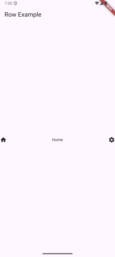
The Row Widget: Horizontal Layout
The Row widget is used to display widgets horizontally, side-by-side. It’s ideal when you need elements next to each other, like navigation links, icon-and-text pairs, or buttons.
Dart
Row(
  // Controls horizontal spacing on the main axis
  mainAxisAlignment: MainAxisAlignment.spaceBetween,
  children: [
    Icon(Icons.home),
    Text('Home'),
    Icon(Icons.settings),
  ],
)
Tip: Adjust
mainAxisAlignment(horizontal) andcrossAxisAlignment(vertical) to control spacing and alignment within the Row. For instance,MainAxisAlignment.spaceAroundprovides equal space on both sides of the children.
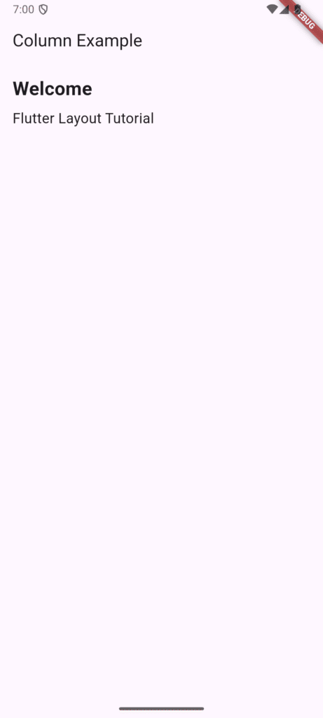
The Column Widget: Vertical Layout
The Column widget arranges widgets vertically, one on top of the other. This is the primary choice for creating lists, forms, or any section that stacks elements from top to bottom.
Dart
Column(
  // Controls horizontal alignment on the cross axis
  crossAxisAlignment: CrossAxisAlignment.start,
  children: [
    Text('Welcome'),
    Text('Flutter Layout Tutorial'),
  ],
)
Just like a Row aligns items horizontally, the Column does the same but vertically—both follow the same alignment logic for their main axis and cross axis.
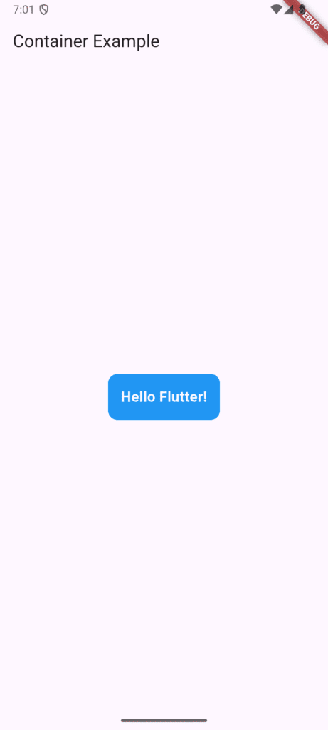
The Container Widget: Styling and Spacing Powerhouse
The Container is arguably the most versatile widget. It’s primarily used for styling, spacing, coloring, and alignment of a single child widget. It gives you precise control over the visual presentation of an element.
Dart
Container(
  padding: EdgeInsets.all(16), // Inner spacing
  decoration: BoxDecoration(
    color: Colors.blue,
    borderRadius: BorderRadius.circular(12),
  ),
  child: Text('Hello Flutter!', style: TextStyle(color: Colors.white)),
)
💡 Pro Tip: Combine Container with Row or Column to apply background styles, borders, and complex spacing around a group of widgets.
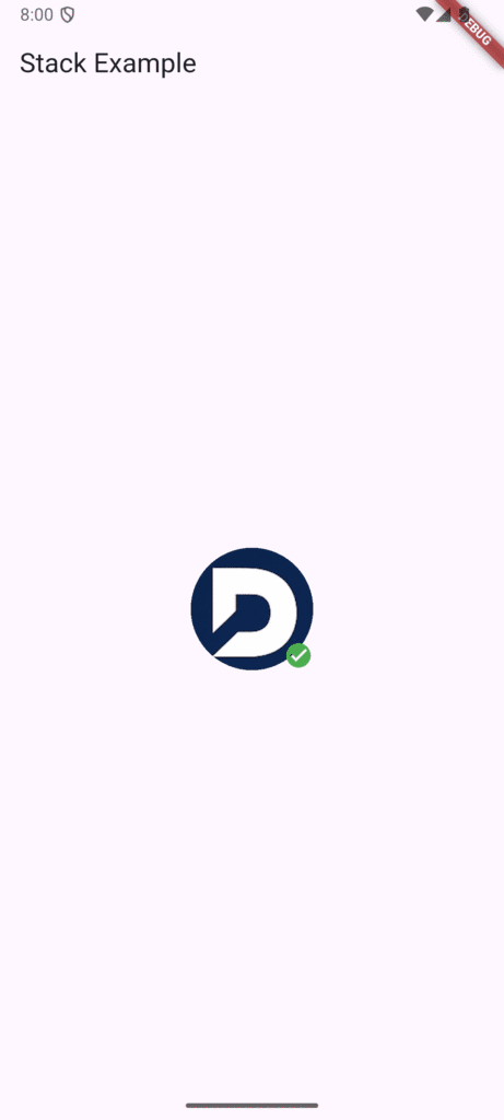
The Stack Widget: Overlapping UIs
Use the Stack widget when you need to overlap widgets on top of one another. This is crucial for creating layered UIs, such as a profile picture with a status badge, or complex background effects.
The children of a Stack are positioned relative to the edges of the box using the Positioned widget.
Dart
Stack(
  children: [
    Image.asset('assets/profile.jpg'), // Base widget
    Positioned(
      right: 0,
      bottom: 0,
      child: Icon(Icons.check_circle, color: Colors.green), // Overlay badge
    ),
  ],
)
3. Spacing Widgets: Achieving Pixel-Perfect Control
Once you know how to place widgets horizontally, vertically, and on top of each other, the next step is managing the space between and around them.
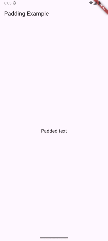
Padding
The Padding widget adds empty space around a child widget, acting as an internal buffer.
Dart
Padding(
  padding: EdgeInsets.all(12),
  child: Text('Padded text'),
)
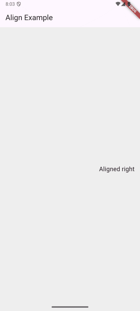
Align
The Align widget controls the alignment of a child widget within the available space of its parent.
Dart
Align(
  alignment: Alignment.centerRight,
  child: Text('Aligned right'),
)
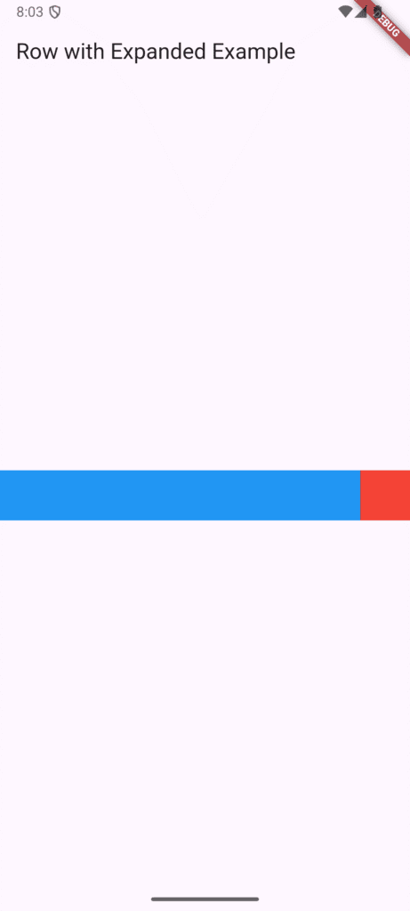
Expanded
The Expanded widget is essential for creating responsive design in Flutter. When placed inside a Row or Column, it forces its child to fill all available space along the main axis.
Dart
Row(
  children: [
    Expanded(child: Container(color: Colors.blue, height: 50)), // Fills remaining space
    Container(width: 50, color: Colors.red, height: 50), // Fixed width
  ],
)
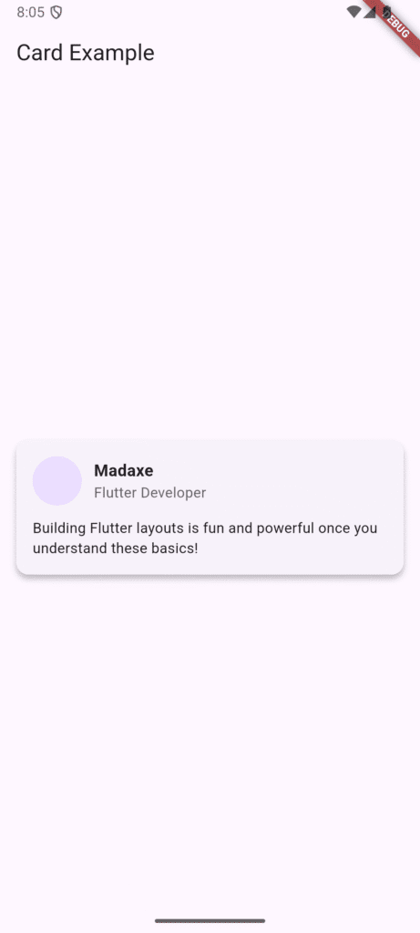
4. Building a Simple Card UI with Layout Widgets
Let’s combine these concepts to build a common element: a user profile card. Notice the nesting of Card, Padding, Column, and Row to achieve the final look.
Dart
Card(
  margin: EdgeInsets.all(16),
  shape: RoundedRectangleBorder(borderRadius: BorderRadius.circular(12)),
  elevation: 4,
  child: Padding(
    padding: EdgeInsets.all(16),
    child: Column( // Main vertical layout
      crossAxisAlignment: CrossAxisAlignment.start,
      children: [
        Row( // Horizontal layout for avatar and text
          children: [
            CircleAvatar(backgroundImage: AssetImage('assets/user.png')),
            SizedBox(width: 12), // Explicit horizontal spacing
            Column( // Vertical layout for name/title
              crossAxisAlignment: CrossAxisAlignment.start,
              children: [
                Text('Madaxe', style: TextStyle(fontWeight: FontWeight.bold)),
                Text('Flutter Developer'),
              ],
            )
          ],
        ),
        SizedBox(height: 12), // Explicit vertical spacing
        Text('Building Flutter layouts is fun and powerful once you understand these basics!'),
      ],
    ),
  ),
)
Key Takeaways for Flutter UI Mastery
| Layout Widget | Primary Function | Axis | Best Use Case |
| Row | Horizontal arrangement | Main: Horizontal | Navigation, Side-by-Side Content |
| Column | Vertical arrangement | Main: Vertical | Forms, Lists, Stacking Sections |
| Container | Styling & Decoration | N/A | Adding color, padding, borders, or size constraints |
| Stack | Layering/Overlapping | N/A | Badges, Overlay Effects |
FAQS
Q1. Should I use Container or Padding for spacing?
👉 Use Padding when your only goal is to add space around the widget. Use Container when you need to combine spacing with other properties like decoration, color, or borders.
Q2. Is it bad to nest multiple Rows and Columns?
👉 While Flutter supports deep nesting, be mindful. Excessive nesting can create complex widget trees, making your code harder to read and debug. For dynamic or very complex screens, consider using a more specialized layout widget like ListView or CustomScrollView when possible.
Q3. What’s the difference between Stack and Column?
👉 Column arranges widgets vertically within its single flow. Stack overlaps widgets, placing the last child on the top layer, completely ignoring the flow layout.
Conclusion
You’ve now mastered one of the most important aspects of Flutter — layout and positioning widgets like Row, Column, Container, Stack, and spacing tools such as Padding, Align, and Expanded. In Part 6, we explored how these widgets allow you to structure your interface, control spacing, and build responsive UIs, culminating in a practical Card UI example. This builds on what we learned in Part 5 – Essential Flutter Widgets, where we discussed the Widget Lifecycle and how Flutter updates and rebuilds widgets dynamically. Combining lifecycle knowledge with layout mastery is key to creating polished, functional, and visually appealing Flutter apps.
As you continue advancing your Flutter skills, the next step is Part 7 – Material vs Cupertino Widgets, where we’ll dive into designing apps that feel native on both Android and iOS. You’ll learn when and how to use Material Design and Cupertino widgets, giving your apps a professional look and platform-appropriate behavior.
Found this helpful? Share it with other Flutter learners and continue following our Flutter tutorial series.