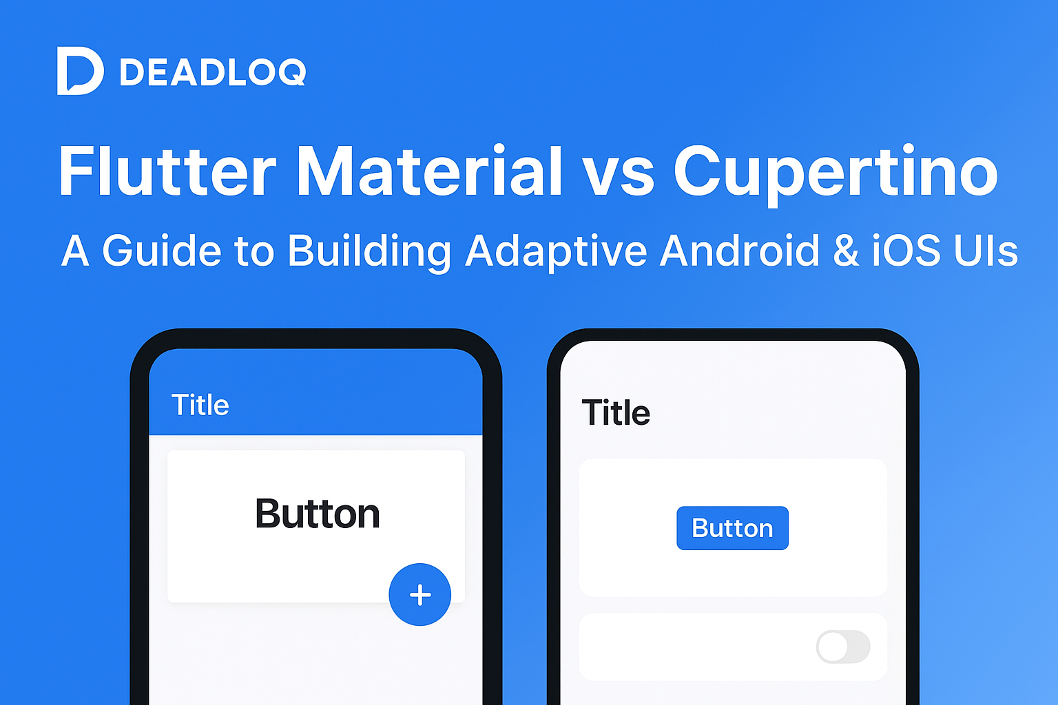
When developing cross-platform apps with Flutter, the key to a native look on both Android and iOS is leveraging the correct design language. Flutter offers two powerful design systems: Material widgets (for Google’s Android look) and Cupertino widgets (replicating Apple’s iOS feel). This ensures a familiar, platform-specific user experience from a single codebase.
If you’re new to Flutter, check out Part 1 – Getting Started with Flutter and Part 6 – Layouts in Flutter to build your foundation.
Quick Summary: Material widgets follow Google’s Android design (bold, layered), while Cupertino widgets replicate Apple’s iOS look (elegant, flat). Flutter lets you mix both for truly adaptive UIs.
Personal Note: In my own Flutter projects, I often start with Material widgets and later adapt key screens with Cupertino components when testing on iOS devices. This hybrid approach keeps both platforms happy without unnecessary code duplication.
Understanding Flutter’s Material Design (For Android)
Material Design is Google’s visual language, focusing on bold colors, motion, and depth, creating visually rich experiences. Flutter’s Material widgets follow this system and are the default for most Flutter apps.
Learn more about Material Design principles at Google’s Material Design Guidelines.
| Material Widgets | Purpose |
|---|---|
| Scaffold | The basic layout structure for an Android screen. |
| AppBar | The top navigation bar, often with shadows. |
| FloatingActionButton | The circular button for a primary action (the FAB). |
| SnackBar | Lightweight feedback popup at the bottom of the screen. |
Use Material Widgets when:
- You’re primarily targeting Android.
- You want a universal modern look.
- Your app follows Google’s design principles.
Flutter’s Cupertino Widgets (For iOS)
Cupertino is Apple’s design language, prioritizing elegance, translucency, and simplicity. Flutter replicates this native iOS look using Cupertino widgets, allowing apps to feel completely native on iPhones and iPads.
For official iOS design standards, refer to Apple’s Human Interface Guidelines.
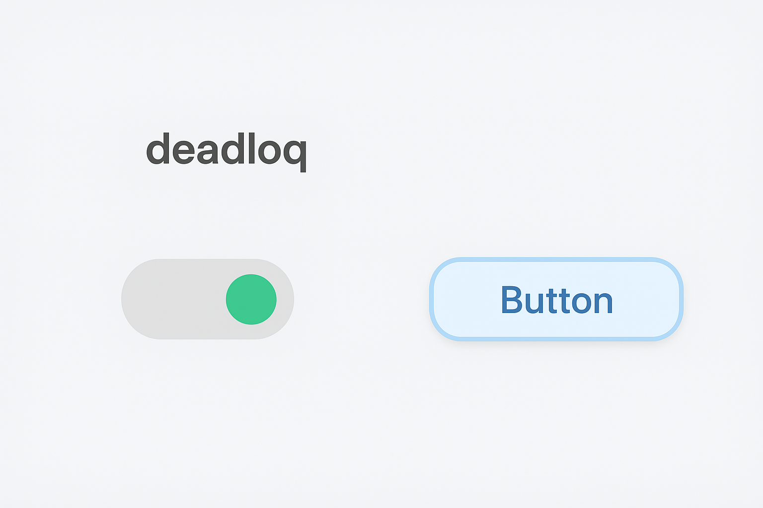
| Cupertino Widgets | Purpose |
|---|---|
| CupertinoPageScaffold | The layout for native iOS pages. |
| CupertinoNavigationBar | The sleek top bar with an iOS-style back button. |
| CupertinoButton | The standard iOS-styled, flat, or rounded button. |
| CupertinoSwitch | The iconic iOS toggle switch. |
Use Cupertino Widgets when:
- You’re targeting iOS devices.
- You want your app to follow Apple’s Human Interface Guidelines (HIG).
- You’re designing an app for Apple-focused users.
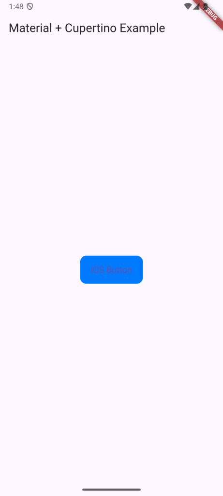
Hybrid UI: Combining Material and Cupertino Widgets in Flutter
The real power of Flutter is that you can mix and match both widget types! You can use the MaterialApp foundation but insert specific Cupertino widgets where you need iOS-specific behavior (e.g., date pickers or navigation bars).
import 'package:flutter/material.dart';
import 'package:flutter/cupertino.dart';

class DualDesignExample extends StatelessWidget {
  @override
  Widget build(BuildContext context) {
    // Using a Material Scaffold as the base
    return Scaffold(
      appBar: AppBar(title: Text('Material + Cupertino Example')),
      body: Center(
        // Embedding a Cupertino widget for the button
        child: CupertinoButton(
          color: CupertinoColors.activeBlue,
          child: Text('iOS Button'),
          onPressed: () {
             // An example of a combined look
          },
        ),
      ),
    );
  }
}
Building Adaptive UIs: Detecting the Platform (iOS vs Android)
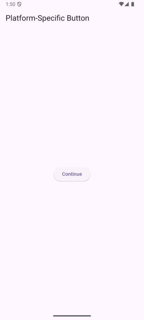
To make your UI automatically adaptive, you can check the current platform using the dart:io library. This is the simple, straightforward way to ensure users get the correct button style on their device automatically.
import 'dart:io' show Platform;

Widget getPlatformButton() {
  if (Platform.isIOS) {
    // This will render only on iOS
    return CupertinoButton(
      color: CupertinoColors.activeBlue,
      child: Text('Continue'),
      onPressed: () {},
    );
  } else {
    // This will render on Android, Web, Desktop, etc.
    return ElevatedButton(
      onPressed: () {},
      child: Text('Continue'),
    );
  }
}
Note: For web compatibility, use Theme.of(context).platform or defaultTargetPlatform instead of dart:io.
For more on platform detection, check Flutter’s official documentation on platform-specific code.
Pro Tip: Use Platform-Adaptive Packages
To truly simplify things, use a package like flutter_platform_widgets. It handles the platform checking and widget switching under the hood, allowing you to write one code snippet for a button, and it automatically renders as Material on Android and Cupertino on iOS. Talk about efficiency!
Additional helpful package:
cupertino_icons– iOS-style icons for Flutter
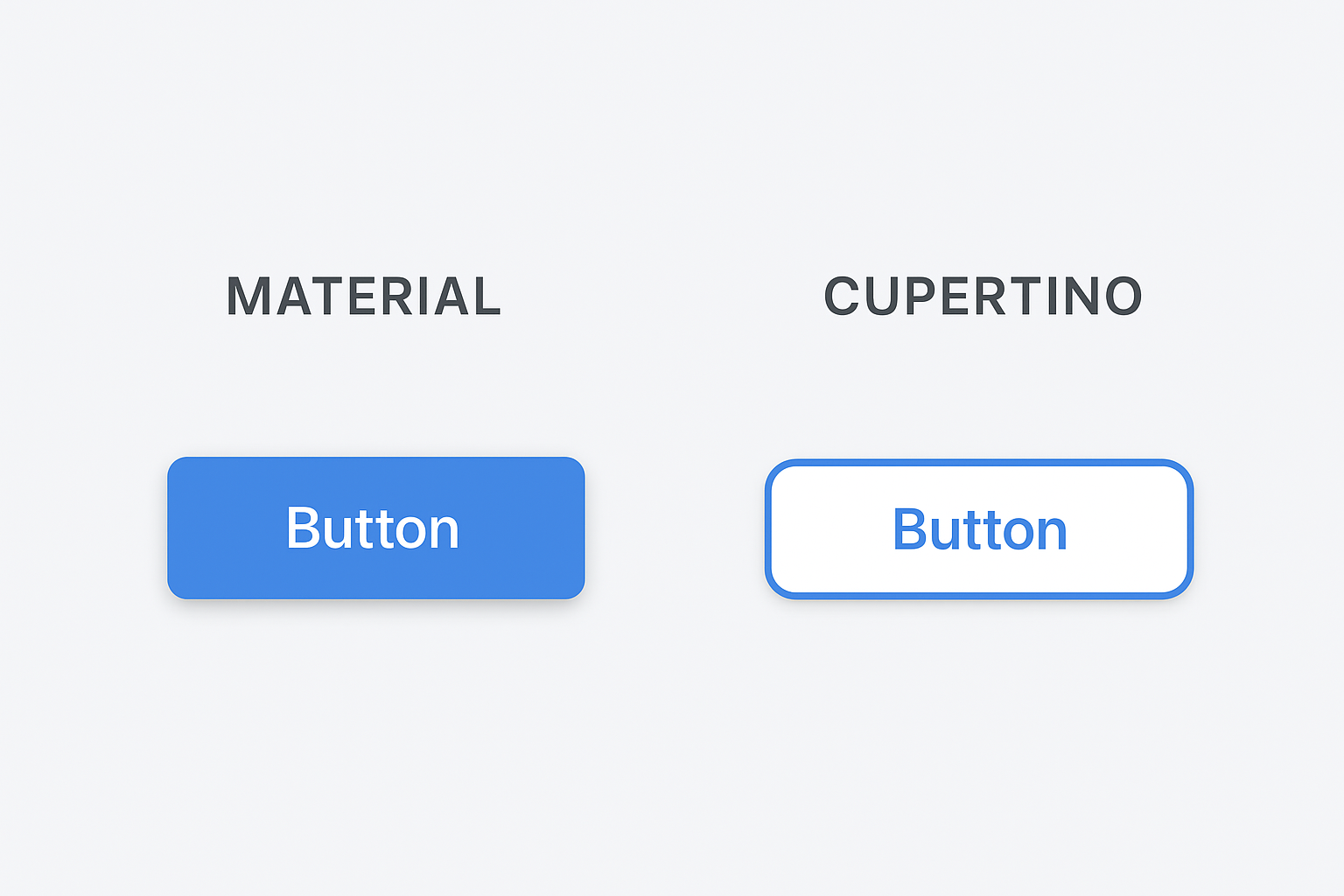
Key Differences at a Glance
| Feature | Material (Android) | Cupertino (iOS) |
|---|---|---|
| Design Philosophy | Bold, expressive, layered (uses “elevation”). | Minimal, elegant, flat (uses “translucency”). |
| Primary Widgets | Scaffold, AppBar, FAB | CupertinoPageScaffold, CupertinoButton |
| Color Scheme | Bright, vibrant, deep primary colors. | Soft, translucent, muted system colors. |
| Navigation | BottomNavigationBar (fixed height). | CupertinoTabBar (translucent, fixed look). |
| Button Style | Filled/Outlined with defined shadows. | Flat, rounded text buttons. |
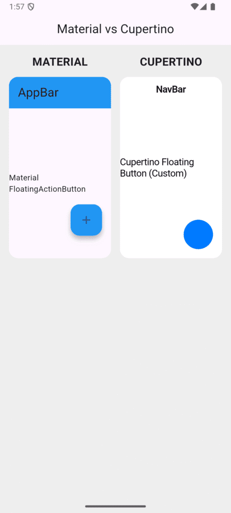
Screenshot idea: Visual comparison chart showing Material vs Cupertino button styles, navigation bars, and switches side-by-side.
Best Practices for Cross-Platform Flutter UI
Be Consistent: Don’t mix styles randomly within the same screen. If you use a CupertinoNavigationBar, pair it with a CupertinoPageScaffold.
Test on Both Platforms: Always use emulators to preview Android (Material) and iOS (Cupertino) versions. Your code might work, but the feel matters.
Adapt Icons & Spacing: Cupertino widgets often have slightly more padding and rely on the cupertino_icons package for native-looking symbols.
Follow Design Guidelines: Use Material Design and Apple HIG for reference to avoid a “Frankenstein” UI.
Consider User Expectations: Android users expect Material design patterns, while iOS users expect Cupertino patterns. It’s about meeting users where they live.
FAQ: Flutter Adaptive Design
Q1: Can I use Material widgets on iOS?
Yes. Flutter supports Material widgets across all platforms, but the look may differ from iOS guidelines. Your app will work perfectly but may feel less native to dedicated iOS users.
Q2: How can I make my Flutter app automatically switch the style?
You can detect the platform using Platform.isIOS or use powerful platform-adaptive packages like flutter_platform_widgets which handle the switching automatically.
Q3: Do Cupertino widgets work on Android?
They do, but they’ll look out of place since they’re styled specifically for iOS. It’s generally better to use Material widgets on Android for a native feel.
Q4: Should I design two versions of the same screen?
Not necessarily. You should design adaptive Flutter UIs that switch widget styles based on the platform, maintaining one codebase with platform-specific presentation logic.
Q5: Which approach is more popular?
Most Flutter apps use Material widgets as the base since they work well on both platforms. Cupertino widgets are then added selectively for iOS-specific screens or when targeting primarily iOS users.
Conclusion
You’ve now understood one of the most important design aspects of Flutter — the difference between Material and Cupertino widgets and how they define the look and feel of your app across Android and iOS. In Part 7, we explored how these design systems shape user experience, when to use each, and how to combine them adaptively to create seamless, platform-aware UIs. This builds upon what we covered in Part 6 – Layouts in Flutter, where you learned to structure interfaces using layout widgets like Row, Column, and Stack. Together, these concepts form the foundation for crafting responsive, native-feeling Flutter apps.
As you continue your Flutter journey, the next step is Part 8 – User Interaction & Input in Flutter, where we’ll explore how to handle user input with buttons, gestures, and text fields to make your app truly interactive. If you found this guide helpful, share it with other Flutter learners and keep following our Flutter Documentation Series for more hands-on tutorials and best practices.
Additional Resources
- Flutter Official Documentation
- Material Design Guidelines
- Apple Human Interface Guidelines
- Flutter Widget Catalog
- flutter_platform_widgets Package
Found this helpful? Share it with other Flutter learners and continue following our Flutter tutorial series.