When building a food delivery app last year, I needed those little +/- buttons you see in every shopping cart. You know—tap minus, quantity drops; tap plus, it goes up. Simple, right?
I spent an hour searching pub.dev for the perfect package. Most were abandoned, bloated, or impossible to style. So I built my own in 50 lines of code.
Best hour I spent that month.
Here’s how to build a clean, customizable quantity selector widget in Flutter that does exactly what you need.
What is a Quantity Widget?
A quantity widget (also called a stepper or quantity selector) is a UI component that lets users adjust numeric values with buttons instead of typing. It typically has three parts:
- Minus button (−) on the left
- Current number in the middle
- Plus button (+) on the right
You see them everywhere:
E-commerce apps → Adjusting cart quantities (“I want 3 shirts”)
Food delivery → Adding items (“Make that 2 burgers”)
Booking apps → Selecting guests or tickets (“4 adults, 2 children”)
Inventory systems → Stock adjustments (“50 units received”)
Why use buttons instead of a text field? Because tapping +/- is way faster on mobile than selecting text, clearing it, and typing a new number. Better UX, fewer errors.
Why Build a Custom Widget?
Packages exist, but here’s why I build custom:
Full control – Style it exactly how you want
Lightweight – 50 lines vs hundreds from a package
No dependencies – No breaking changes or abandoned maintainers
Learning – Understanding [stateful widgets](link to “Stateful vs Stateless Widgets”) is crucial for Flutter
Use a package if:
- You need complex features (haptics, animations) immediately
- You’re prototyping and don’t care about styling
- You want battle-tested edge case handling
For most apps? Custom is cleaner.
The Complete Code
Here’s the full implementation:
import 'package:flutter/material.dart';
void main() => runApp(MyApp());
class MyApp extends StatelessWidget {
@override
Widget build(BuildContext context) {
return MaterialApp(
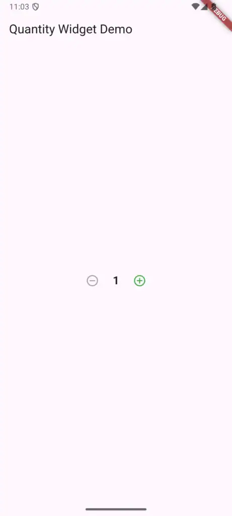
home: Scaffold(
appBar: AppBar(title: Text('Quantity Widget Demo')),
body: Center(
child: QuantityWidget(
initialValue: 1,
minValue: 1,
maxValue: 10,
onChanged: (value) => print("Quantity: $value"),
),
),
),
);
}
}
class QuantityWidget extends StatefulWidget {
final int initialValue;
final int minValue;
final int maxValue;
final Function(int) onChanged;
const QuantityWidget({
Key? key,
this.initialValue = 1,
this.minValue = 1,
this.maxValue = 99,
required this.onChanged,
}) : super(key: key);
@override
_QuantityWidgetState createState() => _QuantityWidgetState();
}
class _QuantityWidgetState extends State<QuantityWidget> {
late int _value;
@override
void initState() {
super.initState();
_value = widget.initialValue;
}
void _increment() {
if (_value < widget.maxValue) {
setState(() => _value++);
widget.onChanged(_value);
}
}
void _decrement() {
if (_value > widget.minValue) {
setState(() => _value--);
widget.onChanged(_value);
}
}
@override
Widget build(BuildContext context) {
return Row(
mainAxisSize: MainAxisSize.min,
children: [
IconButton(
icon: Icon(Icons.remove_circle_outline),
onPressed: _value > widget.minValue ? _decrement : null,
color: Colors.red,
),
Padding(
padding: EdgeInsets.symmetric(horizontal: 12),
child: Text(
'$_value',
style: TextStyle(fontSize: 20, fontWeight: FontWeight.bold),
),
),
IconButton(
icon: Icon(Icons.add_circle_outline),
onPressed: _value < widget.maxValue ? _increment : null,
color: Colors.green,
),
],
);
}
}
How It Works
Why StatefulWidget?
The quantity changes based on user interaction, so we need [state management](link to “Stateful vs Stateless Widgets”). The widget “remembers” the current number and updates the UI when it changes.
The late keyword:
Tells Dart “I’ll initialize this before using it.” We set _value in initState() before the widget builds.
setState() is crucial:
Without it, _value changes internally but the UI doesn’t update. This is a common beginner mistake.
The callback pattern:onChanged lets parent widgets know when quantity changes. Your cart can listen and recalculate totals. This is standard Flutter child-to-parent communication.
Conditional buttons:
Setting onPressed: null disables the button. When you hit min/max, buttons gray out automatically.
Styling Options
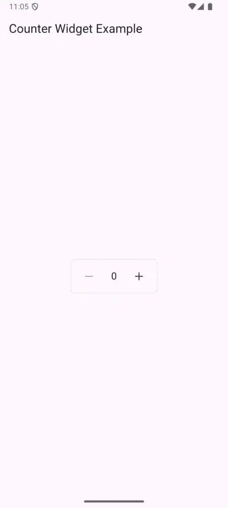
The basic version works but looks plain. Here are three quick styles:
Bordered Style
Container(
  decoration: BoxDecoration(
    border: Border.all(color: Colors.grey.shade300),
    borderRadius: BorderRadius.circular(8),
  ),
  child: Row(
    mainAxisSize: MainAxisSize.min,
    children: [
      IconButton(
        icon: Icon(Icons.remove),
        onPressed: _value > widget.minValue ? _decrement : null,
      ),
      Padding(
        padding: EdgeInsets.symmetric(horizontal: 16),
        child: Text('$_value', style: TextStyle(fontSize: 18)),
      ),
      IconButton(
        icon: Icon(Icons.add),
        onPressed: _value < widget.maxValue ? _increment : null,
      ),
    ],
  ),
)
Filled Background
Container(
  decoration: BoxDecoration(
    color: Colors.grey.shade100,
    borderRadius: BorderRadius.circular(12),
  ),
  padding: EdgeInsets.all(4),
  child: Row(
    mainAxisSize: MainAxisSize.min,
    children: [
      IconButton(
        icon: Icon(Icons.remove, size: 20),
        onPressed: _decrement,
        constraints: BoxConstraints(),
      ),
      Container(
        width: 40,
        alignment: Alignment.center,
        child: Text('$_value', style: TextStyle(fontWeight: FontWeight.bold)),
      ),
      IconButton(
        icon: Icon(Icons.add, size: 20),
        onPressed: _increment,
        constraints: BoxConstraints(),
      ),
    ],
  ),
)
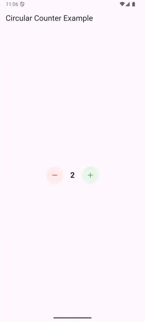
Modern Circular
Row(
  mainAxisSize: MainAxisSize.min,
  children: [
    Container(
      decoration: BoxDecoration(
        color: Colors.red.shade50,
        shape: BoxShape.circle,
      ),
      child: IconButton(
        icon: Icon(Icons.remove, color: Colors.red),
        onPressed: _decrement,
      ),
    ),
    Padding(
      padding: EdgeInsets.symmetric(horizontal: 20),
      child: Text('$_value', style: TextStyle(fontSize: 22, fontWeight: FontWeight.bold)),
    ),
    Container(
      decoration: BoxDecoration(
        color: Colors.green.shade50,
        shape: BoxShape.circle,
      ),
      child: IconButton(
        icon: Icon(Icons.add, color: Colors.green),
        onPressed: _increment,
      ),
    ),
  ],
)
Pick what matches your app’s design. The core logic stays the same—only the build() method changes.
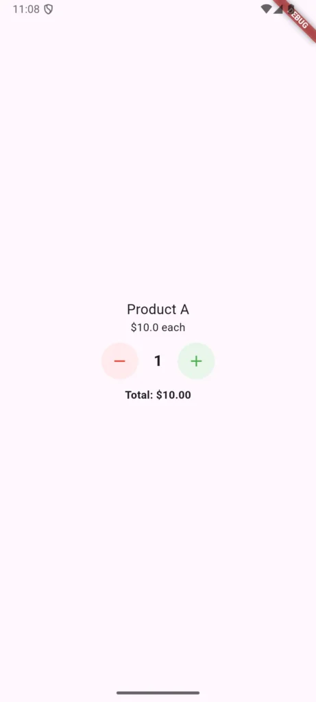
Real-World Usage Example
Here’s how to use it in a shopping cart:
class CartItem extends StatefulWidget {
  final String productName;
  final double price;

  CartItem({required this.productName, required this.price});

  @override
  _CartItemState createState() => _CartItemState();
}

class _CartItemState extends State<CartItem> {
  int quantity = 1;

  double get total => widget.price * quantity;

  @override
  Widget build(BuildContext context) {
    return ListTile(
      title: Text(widget.productName),
      subtitle: Text('\$${widget.price.toStringAsFixed(2)} each'),
      trailing: Column(
        mainAxisAlignment: MainAxisAlignment.center,
        children: [
          QuantityWidget(
            initialValue: quantity,
            minValue: 1,
            maxValue: 99,
            onChanged: (value) {
              setState(() => quantity = value);
            },
          ),
          Text('Total: \$${total.toStringAsFixed(2)}'),
        ],
      ),
    );
  }
}
When quantity changes, the total updates automatically. Simple and effective.
Common Problems & Solutions
Problem 1: Value doesn’t update in parent widget
Make sure you’re calling setState() in the parent:
QuantityWidget(
  onChanged: (newValue) {
    setState(() {
      cartItem.quantity = newValue; // Must use setState
    });
  },
)
Problem 2: Widget looks weird on tablets
Use LayoutBuilder for responsive sizing:
LayoutBuilder(
  builder: (context, constraints) {
    double size = constraints.maxWidth > 600 ? 48 : 40;
    // Use size for buttons
  },
)
Problem 3: Need haptic feedback
Add this import and update your methods:
import 'package:flutter/services.dart';

void _increment() {
  if (_value < widget.maxValue) {
    HapticFeedback.lightImpact();
    setState(() => _value++);
    widget.onChanged(_value);
  }
}
Learn more about [handling user interaction in Flutter](link to “User Interaction & Input”).
Problem 4: Initial value doesn’t match async data
Use null-aware operators:
QuantityWidget(
  initialValue: cartData?.quantity ?? 1,
  // ...
)
Adding Animation (Optional)
Want the number to scale when it changes? Use AnimatedSwitcher:
AnimatedSwitcher(
  duration: Duration(milliseconds: 200),
  transitionBuilder: (child, animation) {
    return ScaleTransition(scale: animation, child: child);
  },
  child: Text(
    '$_value',
    key: ValueKey<int>(_value), // Required for animation
    style: TextStyle(fontSize: 20, fontWeight: FontWeight.bold),
  ),
)
Small touch, big impact on UX.
State Management Integration
If you’re using Provider or Riverpod:
QuantityWidget(
  initialValue: context.watch<CartProvider>().getQuantity(productId),
  onChanged: (value) {
    context.read<CartProvider>().updateQuantity(productId, value);
  },
)
Want to learn state management? Check out our [Calculator App with Provider tutorial](link to “Build a Flutter Calculator App with Provider”).
Accessibility
Don’t forget users with accessibility needs:
IconButton(
  icon: Icon(Icons.add),
  onPressed: _increment,
  tooltip: 'Increase quantity',
  semanticsLabel: 'Increase quantity by one',
)
The tooltip shows on long press, and semanticsLabel helps screen readers. See Flutter’s accessibility guide for more.
Best Practices
Define min/max values – Prevent invalid quantities
Make it responsive – Test on different screen sizes
Add visual feedback – Show when limits are reached
Consider haptics – Physical feedback improves UX
Use proper callbacks – Let parent widgets react to changes
Performance Note
This widget is lightweight. The setState() call only rebuilds the QuantityWidget, not your entire screen. For large lists with many quantity widgets, wrap each in RepaintBoundary:
RepaintBoundary(
  child: QuantityWidget(...),
)
Learn more about Flutter performance optimization.
The Bottom Line
A quantity selector seems simple until you need one. This 50-line widget:
- Works reliably out of the box
- Handles edge cases (min/max limits)
- Integrates with any state management
- Can be styled to match any design
- Performs well even in large lists
You could spend time finding and configuring a package, or paste this code and keep building your app.
What’s Next?
Now that you have a reusable widget, explore:
- Master widgets – Understanding Flutter Widgets teaches widget composition
- Learn layouts – Flutter Layouts Guide shows how to position widgets
- Build projects – Try our 10 Beginner Flutter Projects
- Avoid mistakes – Check Top 7 Flutter Mistakes Beginners Make
- Understand state – Our Stateful vs Stateless guide is essential reading
Questions about implementing this in your app? Drop a comment below and I’ll help you out.
Now go build something cool.