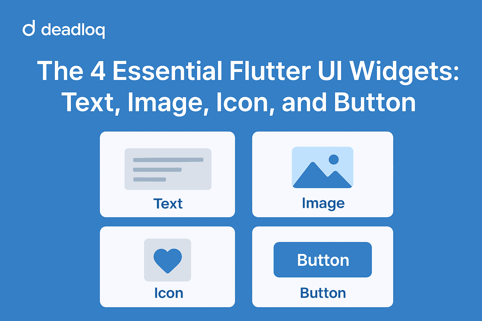
Flutter’s power lies in its widgets — the building blocks of every app interface. After learning about Dart and widget basics in earlier parts, it’s time to meet the most essential UI widgets you’ll use every single day: Text, Image, Icon, and Button.
Why These Widgets Matter
Before diving into custom layouts or animations, it’s vital to master these basics. They’re simple yet powerful — they form the foundation of nearly every Flutter app screen you’ll build.
1. Text Widget
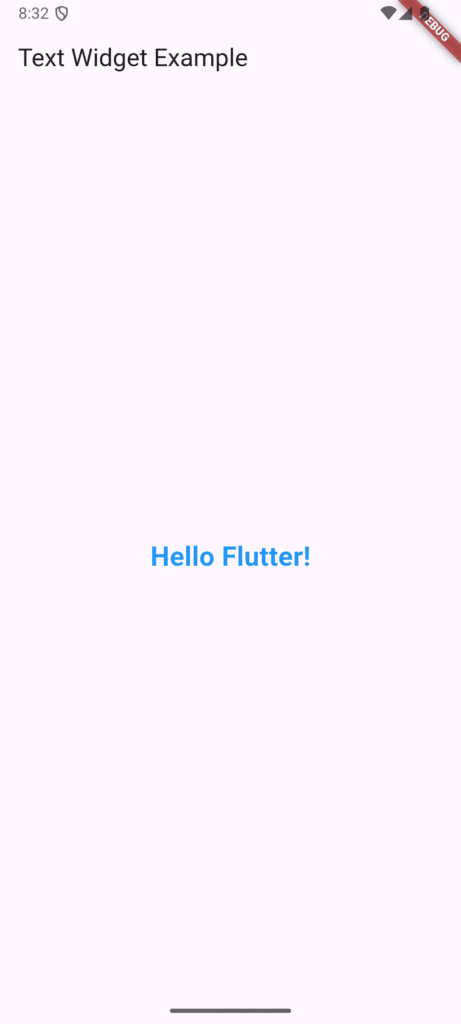
The Text widget displays a string of text with customizable style.
Text(
  'Hello Flutter!',
  style: TextStyle(
    fontSize: 24,
    fontWeight: FontWeight.bold,
    color: Colors.blue,
  ),
)
Tip: Always use TextStyle to control appearance — font, size, color, and weight.
Example Output:
Hello Flutter! (Blue, Bold, 24px)
Learn more about advanced text styling in the official Flutter TextStyle documentation.
2. Image Widget
The Image widget lets you display images from assets, the internet, or memory.
// From local assets
Image.asset('assets/images/flutter_logo.png')

// From the web
Image.network(
  'https://flutter.dev/assets/flutter-logo-sharing.png',
  height: 100,
  loadingBuilder: (context, child, progress) {
    if (progress == null) return child;
    return CircularProgressIndicator();
  },
  errorBuilder: (context, error, stackTrace) {
    return Icon(Icons.error);
  },
)
Tip: Use Image.asset for local files and Image.network for online images. Add your image under assets: in pubspec.yaml.
For better performance with network images, check out the cached_network_image package on pub.dev.
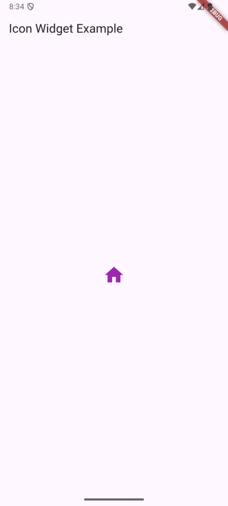
3. Icon Widget
Icons make your app look modern and intuitive.
Icon(
  Icons.home,
  color: Colors.purple,
  size: 40,
)
Tip: Flutter has hundreds of built-in icons in the Material Icons package. You can also use custom icon packs from pub.dev.
Browse all available icons at Google’s Material Icons Gallery. For custom icons, explore Font Awesome Flutter.
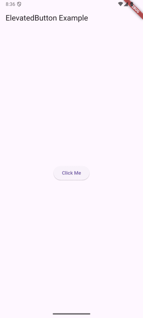
4. Button Widgets
Flutter provides different buttons — each with its unique look and purpose.
ElevatedButton
ElevatedButton(
  onPressed: () {
    print('Button pressed!');
  },
  child: Text('Click Me'),
)
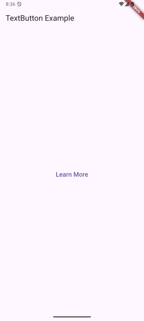
TextButton
TextButton(
  onPressed: () {},
  child: Text('Learn More'),
)
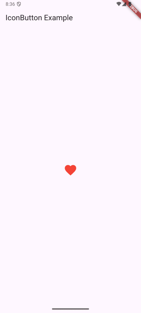
IconButton
IconButton(
  icon: Icon(Icons.favorite),
  color: Colors.red,
  onPressed: () {},
)
Tip: Use ElevatedButton for primary actions, TextButton for secondary ones, and IconButton for compact UI controls.
Explore more button options in Flutter’s Material Components guide.
Combine Widgets Together
Now that you understand individual widgets, let’s see how they work together. You can mix widgets inside a Column or Row:
Column(
  children: [
    Text('Welcome to Flutter'),
    Image.network('https://flutter.dev/images/flutter-logo-sharing.png'),
    ElevatedButton(
      onPressed: () {},
      child: Text('Get Started'),
    ),
  ],
)
Next, you’ll learn how to control spacing and positioning more precisely in Part 6.
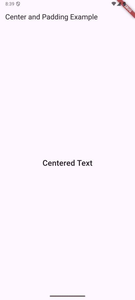
Pro Tip
Wrap widgets inside Padding, Container, or Center for better spacing and alignment.
For example:
Center(
  child: Padding(
    padding: EdgeInsets.all(16),
    child: Text('Centered Text'),
  ),
)
Master Flutter layouts with the official layout tutorial.
FAQs
1. Can I use multiple Text widgets on one screen?
Yes! You can place as many as you like inside layout widgets like Column, Row, or Stack.
2. How do I make images responsive?
Use BoxFit.cover or wrap the image in a SizedBox to control its height and width.
3. What’s the difference between IconButton and ElevatedButton with an icon?IconButton is for icon-only actions. For buttons with both text and icon, use ElevatedButton.icon().
4. Why does my image not appear?
Ensure it’s correctly added under assets: in pubspec.yaml and run flutter pub get again.
Conclusion
You’ve now mastered some of the most essential Flutter widgets — Text, Image, Icon, and Button — the core building blocks of every Flutter interface. In Part 5, we explored how these widgets bring life to your app by displaying content, adding visuals, and enabling user interaction. Understanding how to effectively combine and style these widgets is key to creating polished, engaging, and intuitive UIs.
As you continue building your Flutter skills, remember that mastering these basics is what allows you to confidently move toward more advanced concepts like layout design, responsiveness, and state management. If you’d like to revisit how Flutter’s UI dynamically updates, check out Part 4 – Stateless vs Stateful Widgets, where we discussed the foundation of UI behavior and state changes.
Once you feel comfortable with these visual widgets, get ready for the next step in your journey — Part 6 – Layout & Positioning Widgets. There, we’ll explore how to use layout widgets like Container, Row, and Column to structure your interface and create responsive designs that look great on any screen size.
Found this helpful? Share it with other Flutter learners and continue following our Flutter tutorial series.
Additional Resources
- Flutter Widget Catalog – Complete reference
- Material Design Guidelines – Design principles
- pub.dev – Flutter packages repository