User interaction sits at the heart of every modern app. Whether users tap a button, type into a form, or swipe through content, the experience they have directly shapes how long they stay and how naturally the app flows. This part of the documentation series focuses on three essential pieces of user input in Flutter: Buttons, TextFields, and Gestures.
Flutter makes handling these interactions surprisingly intuitive, and with the right techniques, you can turn a basic UI into a deeply interactive and responsive experience.
What You’ll Learn: By the end of this guide, you’ll build interactive forms with validation, gesture-enabled cards, and responsive buttons—all connected to live state updates.
Part of the Flutter Documentation Series
Full series: View All Parts | Previous: Part 7 – Material vs Cupertino | Next: Part 9 – State Management Basics
Why User Interaction Matters in App Development
Even the most beautiful UI falls flat if users cannot interact with it effortlessly. Smooth input handling:
- Improves usability
- Reduces errors
- Makes your app feel alive
- Enhances accessibility
- Guides user behavior naturally
By mastering user input early, you’ll unlock the ability to build login systems, forms, actions, settings pages, and even fully custom interactive widgets.
1. Buttons in Flutter
Flutter provides a rich set of button widgets designed for different use-cases. Buttons trigger actions—navigation, form submission, state changes, animations, and more.
Quick Recap: In Part 5 – Essential Flutter Widgets, we introduced basic button widgets. Now we’ll explore them in depth with practical interaction patterns.
1.1 Common Button Types
| Button Type | Use Case |
|---|---|
| ElevatedButton | Primary actions, high emphasis |
| TextButton | Low emphasis, subtle actions |
| OutlinedButton | Medium emphasis, bordered actions |
| IconButton | Tapping actions represented with icons |
| FloatingActionButton | Prominent app-level action (add, create, scan) |
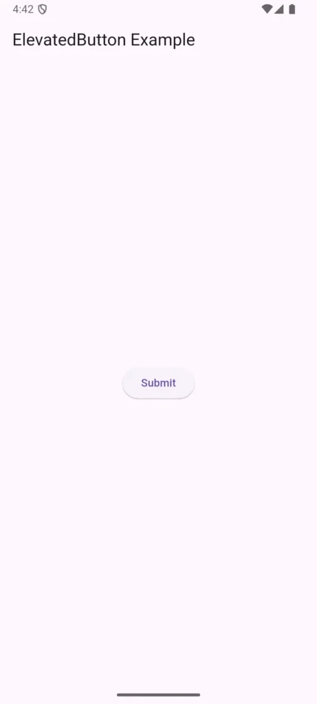
1.2 Example: Basic ElevatedButton
ElevatedButton(
  onPressed: () {
    print("Button Pressed!");
  },
  child: Text("Submit"),
)
1.3 Best Practices
- Keep button text clear and action-oriented (“Save”, “Continue”, “Send”).
- Maintain consistent button spacing and sizing.
- Disable buttons when input is incomplete.
- Add loading indicators for long operations.
Learn more: Flutter’s Material Design buttons documentation provides detailed guidelines on button usage and accessibility.
2. TextField – Handling User Input
TextFields allow users to type text—emails, passwords, search queries, notes, and more.
Flutter’s TextField widget is highly customizable and integrates well with controllers for reading user input. For a deeper understanding of how controllers work in Dart, check out the Dart Language Tour.
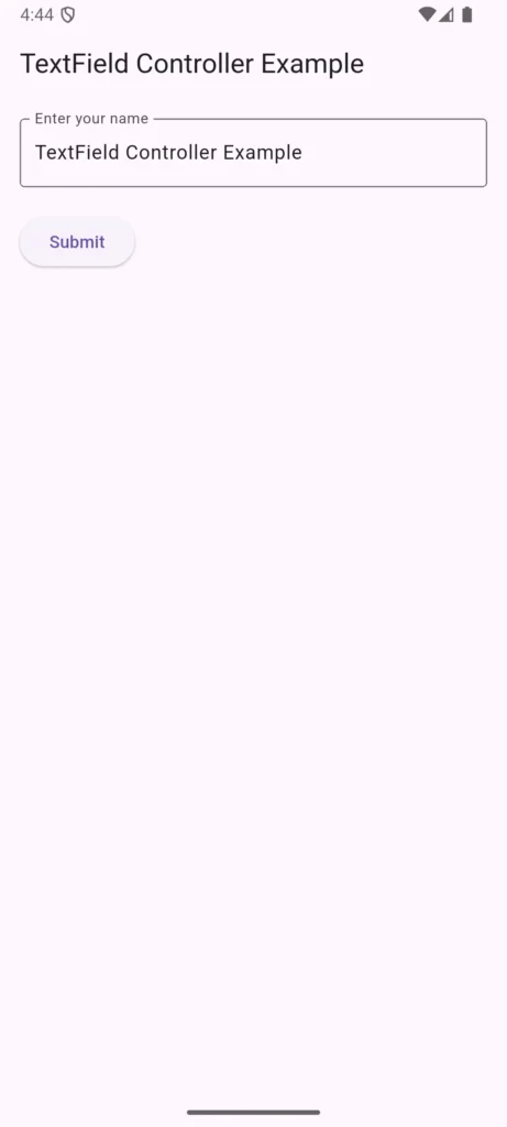
2.1 Basic TextField Example
final TextEditingController controller = TextEditingController();

TextField(
  controller: controller,
  decoration: InputDecoration(
    labelText: "Enter your name",
    border: OutlineInputBorder(),
  ),
)
2.2 Reading Input
String name = controller.text;
print(name);
2.3 Improving TextField Experience
- Validate input in real-time.
- Use
TextInputType.emailAddressor others for smart keyboards. - Use
obscureText: truefor passwords. - Add prefixes/suffixes (icons, labels) for clarity.
2.4 Example With Validation
TextField(
  onChanged: (value) {
    if (value.length < 3) {
      print("Name too short");
    }
  },
  decoration: InputDecoration(
    labelText: "Username",
  ),
)
2.5 Using Form for Structured Validation
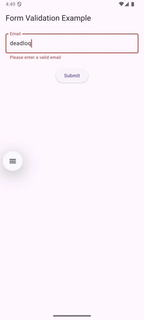
For complete forms with multiple fields, wrap your inputs in a Form widget:
final _formKey = GlobalKey<FormState>();

Form(
  key: _formKey,
  child: Column(
    children: [
      TextFormField(
        decoration: InputDecoration(labelText: 'Email'),
        validator: (value) {
          if (value == null || value.isEmpty) {
            return 'Please enter your email';
          }
          if (!value.contains('@')) {
            return 'Please enter a valid email';
          }
          return null;
        },
      ),
      ElevatedButton(
        onPressed: () {
          if (_formKey.currentState!.validate()) {
            print('Form is valid!');
          }
        },
        child: Text('Submit'),
      ),
    ],
  ),
)
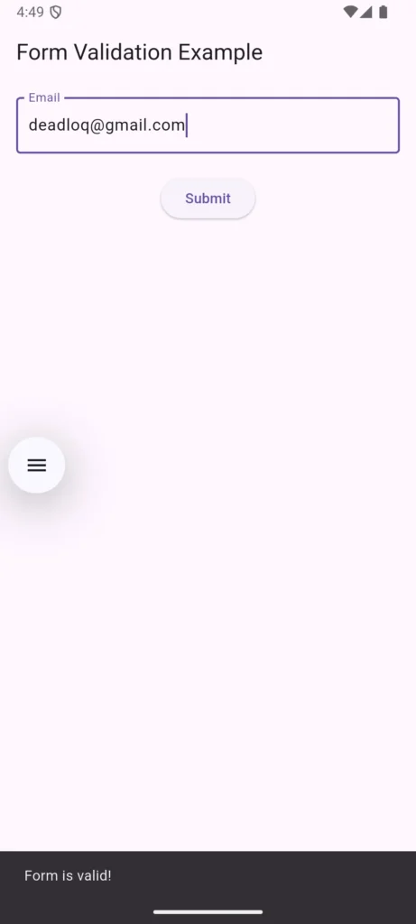
Pro tip: For comprehensive form handling patterns, explore Flutter’s official Form validation cookbook.
3. Understanding Gestures in Flutter
Buttons and text input are great, but modern apps also rely heavily on gestures—taps, swipes, long presses, drags, and more.
Flutter’s GestureDetector allows you to capture almost any interaction.
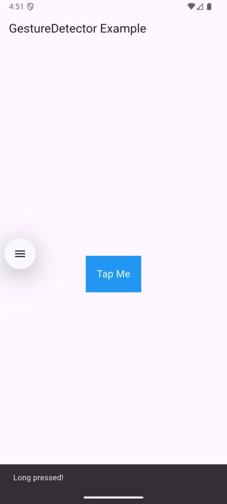
3.1 GestureDetector Example
GestureDetector(
  onTap: () {
    print("Box tapped!");
  },
  onLongPress: () {
    print("Long pressed!");
  },
  child: Container(
    padding: EdgeInsets.all(20),
    color: Colors.blue,
    child: Text("Tap Me", style: TextStyle(color: Colors.white)),
  ),
)
3.2 Useful GestureDetector Events
onTaponDoubleTaponLongPressonPanUpdate(drag)onHorizontalDragonVerticalDrag
3.3 When to Use Gestures
Gestures are perfect for:
- Custom buttons
- Swipable cards
- Drag-and-drop UI
- Long-press menus or context actions
- Horizontal scroll interactions
But avoid using gestures everywhere—they can clash with built-in scrolling or feel unintuitive if misused.
4. Connecting User Input to State Management
User input becomes powerful when combined with state updates. For example:
- A button triggers a counter change
- A TextField updates a displayed name
- A gesture opens a drawer or toggles UI
Building on Previous Knowledge: Remember from Part 4 – Stateless vs Stateful Widgets that StatefulWidgets allow us to rebuild the UI when data changes. Here’s how user input triggers those updates.
4.1 Example Using setState()
class CounterWidget extends StatefulWidget {
  @override
  _CounterWidgetState createState() => _CounterWidgetState();
}

class _CounterWidgetState extends State<CounterWidget> {
  int count = 0;

  @override
  Widget build(BuildContext context) {
    return Column(
      mainAxisAlignment: MainAxisAlignment.center,
      children: [
        Text(
          'Count: $count',
          style: TextStyle(fontSize: 24),
        ),
        SizedBox(height: 20),
        ElevatedButton(
          onPressed: () {
            setState(() {
              count++;
            });
          },
          child: Text("Increase"),
        ),
      ],
    );
  }
}
In real apps, you’ll eventually combine user input with Riverpod, Provider, Bloc, or other state management solutions for scalability.
Coming Up Next: In Part 9 – State Management Basics, we’ll dive deeper into
setState()and build a complete To-Do list app that manages multiple items with full CRUD operations.
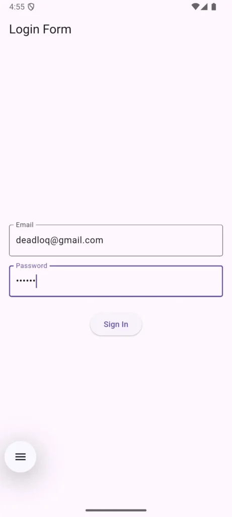
5. Putting It All Together: A Simple Login Form
Here’s a practical example combining buttons, TextFields, and state:
class LoginForm extends StatefulWidget {
  @override
  _LoginFormState createState() => _LoginFormState();
}

class _LoginFormState extends State<LoginForm> {
  final emailController = TextEditingController();
  final passwordController = TextEditingController();
  final _formKey = GlobalKey<FormState>();

  @override
  Widget build(BuildContext context) {
    return Padding(
      padding: EdgeInsets.all(16),
      child: Form(
        key: _formKey,
        child: Column(
          mainAxisAlignment: MainAxisAlignment.center,
          children: [
            TextFormField(
              controller: emailController,
              decoration: InputDecoration(
                labelText: 'Email',
                border: OutlineInputBorder(),
              ),
              keyboardType: TextInputType.emailAddress,
              validator: (value) {
                if (value == null || value.isEmpty) {
                  return 'Please enter your email';
                }
                return null;
              },
            ),
            SizedBox(height: 16),
            TextFormField(
              controller: passwordController,
              decoration: InputDecoration(
                labelText: 'Password',
                border: OutlineInputBorder(),
              ),
              obscureText: true,
              validator: (value) {
                if (value == null || value.length < 6) {
                  return 'Password must be at least 6 characters';
                }
                return null;
              },
            ),
            SizedBox(height: 24),
            ElevatedButton(
              onPressed: () {
                if (_formKey.currentState!.validate()) {
                  print('Login: ${emailController.text}');
                  // Handle login logic here
                }
              },
              child: Text('Sign In'),
            ),
          ],
        ),
      ),
    );
  }

  @override
  void dispose() {
    emailController.dispose();
    passwordController.dispose();
    super.dispose();
  }
}
6. UX Tips to Improve User Interaction
Here are simple enhancements that instantly make your input experience feel more professional:
✔ Add visual feedback (ripple effect, shadows)
✔ Use focus management (auto-focus next field)
✔ Provide error messages and helper text
✔ Wrap inputs in Form for structured validation
✔ Add haptic feedback (vibration) on important actions
✔ Keep tap areas large enough for fingers (min 48px)
FAQs – User Interaction & Input in Flutter
1. How do I validate a TextField in Flutter?
Use a Form and TextFormField with a validator function. Flutter will automatically handle validation messages.
2. Why does my GestureDetector not work on some widgets?
GestureDetector may conflict with widgets that have their own gestures (like ListView). A common fix is adding behavior: HitTestBehavior.opaque.
3. Should I always use GestureDetector instead of buttons?
No. Use GestureDetector for custom designs. For standard taps, use Flutter’s built-in button widgets—they include ripple effects, accessibility, and focus states automatically.
4. How do I clear the text from a TextField?
Call:
controller.clear();
5. Can I combine multiple gestures on one widget?
Yes! You can use multiple callbacks like onTap, onLongPress, and onDoubleTap in the same GestureDetector.
Summary
User interaction is what transforms a static UI into a living, breathing app. By mastering buttons, TextFields, and gestures, you’ve unlocked the foundation for building forms, actions, and custom interactions that feel natural and responsive.
What We Covered:
- ✅ Different button types and when to use them
- ✅ TextField handling with validation and Forms
- ✅ Gesture detection for custom interactions
- ✅ Connecting user input to state with setState()
- ✅ Building a complete login form
Next Steps:
In Part 9 – State Management Basics, we’ll explore how setState() works under the hood and build a fully functional To-Do list app with add, delete, and toggle functionality.
Upcoming Parts in This Series
Here’s what’s coming next in the Flutter Documentation Series:
- Part 10 – Navigation & Routing – Moving between screens, named routes
- Part 11 – Styling & Themes – Colors, fonts, dark mode, ThemeData
- Part 12 – Networking in Flutter – Fetching API data, displaying lists
- Part 13 – JSON Parsing in Dart – Converting API JSON into Dart models
- Part 14 – Local Storage – SharedPreferences, storing app settings
- Part 15 – State Management Advanced – Provider, Riverpod, Bloc overview
- Part 16 – Animations in Flutter – Implicit & explicit animations
- Part 17 – Forms & Validation – Complete login form & validation rules
- Part 18 – Publishing Your App – Building APKs & preparing for stores
- Part 19 – Flutter Best Practices – Folder structure, performance, clean code
Found this helpful? Share it with other Flutter learners and continue following our Flutter tutorial series.
