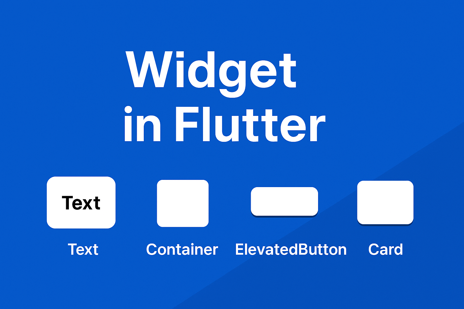
Everything in Flutter is a widget. Literally everything.
That button? Widget. That text? Widget. The padding around the text? Widget. Your entire screen? Just widgets inside widgets inside widgets.
When I first saw Flutter code, I thought “why is everything a widget?” It felt weird. Then it clicked: widgets are just LEGO blocks. Once you understand that, Flutter becomes stupidly simple.
Let me show you what I wish someone had told me on day one.
What Actually Is a Widget?
A widget in Flutter is a building block of your user interface. It describes what a piece of your app should look like at any given moment.
Think of widgets like LEGO bricks:
- Want to build a house? Use bricks (Container), windows (Image), and a door (Button)
- Need a city? Combine multiple houses together
- Want a castle? Stack towers (widgets) on top of each other
That’s Flutter. You build complex UIs by combining simple widgets.
The framework handles all the messy stuff—rendering, updating, optimizing performance. You just describe what you want, and Flutter makes it happen.
The Two Types of Widgets (This Is Important)
Every widget in Flutter falls into one of two categories. Understanding the difference will save you hours of confusion.
Stateless Widgets: The “Set It and Forget It” Type
A Stateless Widget doesn’t change after it’s built. It displays something once, and that’s it.
When to use:
- Static text that never changes
- Icons that just sit there
- Labels, titles, or any display-only content
Real-world examples:
- App bar title (“Settings”)
- Static product description
- Company logo
- Copyright text at the bottom
Still not sure when to use Stateless vs Stateful? Our Stateful vs Stateless Widgets guide has a complete decision flowchart.
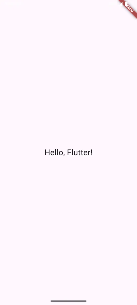
Here’s the simplest widget you can make:
class MyStatelessWidget extends StatelessWidget {
  @override
  Widget build(BuildContext context) {
    return Text("Hello, Flutter!");
  }
}
The build() method runs once, creates the UI, and that’s it. Simple.
Stateful Widgets: The “Interactive” Type
A Stateful Widget can change based on user interaction or data updates. It “remembers” information and updates the UI when that information changes.
When to use:
- Anything users interact with
- Forms with text input
- Checkboxes, switches, sliders
- Counters, timers, animations
- Data that loads from an API
Real-world examples:
- Shopping cart (quantity changes)
- Like button (toggles on/off)
- Text field (updates as you type)
- Loading spinner (appears then disappears)
Need help deciding which to use? Check our Stateful vs Stateless Widgets guide for a detailed comparison with examples.
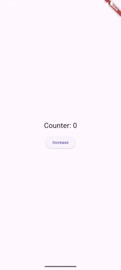
Here’s a simple counter that goes up when you tap a button:
class MyStatefulWidget extends StatefulWidget {
  @override
  _MyStatefulWidgetState createState() => _MyStatefulWidgetState();
}

class _MyStatefulWidgetState extends State<MyStatefulWidget> {
  int counter = 0;

  void _increment() {
    setState(() {
      counter++;
    });
  }

  @override
  Widget build(BuildContext context) {
    return Column(
      children: [
        Text("Counter: $counter"),
        ElevatedButton(
          onPressed: _increment,
          child: Text("Increase"),
        ),
      ],
    );
  }
}
Notice the setState() call? That’s the magic. It tells Flutter “hey, something changed, rebuild this widget.” Without it, the counter would increment internally but the screen wouldn’t update.
The Widget Tree: How Flutter Organizes Everything
Flutter organizes widgets in a tree structure. Think of it like a family tree, but for your UI.
graph TD
    A[MaterialApp] --> B[Scaffold]
    B --> C[AppBar]
    B --> D[Body]
    C --> E[Text]
    D --> F[Column]
    F --> G[Text]
    F --> H[TextField]
    F --> I[ElevatedButton]
    I --> J[Text]
Each widget can have children (widgets inside it), and every widget has a parent (the widget it’s inside).
This matters because:
- Layout flows from parent to child – A parent tells its children how much space they have
- Data can flow down the tree – Parent widgets can pass information to children
- Changes rebuild efficiently – Flutter only rebuilds the parts that changed
Understanding the widget tree helps you debug layout issues. When something’s not positioned right, you’re usually missing a wrapper widget or using the wrong parent.
Widgets You’ll Use Every Single Day
Let me show you the widgets you’ll reach for constantly:
Text
Displays text. Simple, but powerful with styling:
Text(
  "Hello World",
  style: TextStyle(fontSize: 24, fontWeight: FontWeight.bold),
)
Container
Your Swiss Army knife. It’s a box that can hold other widgets and apply padding, margins, colors, borders, etc:
Container(
  padding: EdgeInsets.all(16),
  color: Colors.blue,
  child: Text("I'm inside a blue box"),
)
Row & Column
Arrange widgets horizontally (Row) or vertically (Column). You’ll use these more than any other layout widget:
Row(
  children: [
    Icon(Icons.star),
    Text("5.0"),
  ],
)

Column(
  children: [
    Text("Title"),
    Text("Subtitle"),
  ],
)
Stack
Puts widgets on top of each other. Perfect for overlays, badges, or profile pictures with an edit icon:
Stack(
  children: [
    Image.network("profile.jpg"),
    Positioned(
      bottom: 0,
      right: 0,
      child: Icon(Icons.edit),
    ),
  ],
)
ListView
Scrollable list of items. Your Instagram feed, contact list, or any vertical scrolling list:
ListView(
  children: [
    ListTile(title: Text("Item 1")),
    ListTile(title: Text("Item 2")),
    ListTile(title: Text("Item 3")),
  ],
)
Image
Displays images from assets, network, or files:
Image.network("https://example.com/image.jpg")
Image.asset("assets/logo.png")
Scaffold
The skeleton of your screen. Provides app bar, body, floating button, drawer—everything a screen needs:
Scaffold(
  appBar: AppBar(title: Text("My App")),
  body: Center(child: Text("Content here")),
  floatingActionButton: FloatingActionButton(
    onPressed: () {},
    child: Icon(Icons.add),
  ),
)
How This Looks in a Real App
Let’s build a simple login screen to see how widgets combine:
Scaffold(
  appBar: AppBar(
    title: Text("Login"),
  ),
  body: Padding(
    padding: EdgeInsets.all(16),
    child: Column(
      mainAxisAlignment: MainAxisAlignment.center,
      children: [
        TextField(
          decoration: InputDecoration(labelText: "Email"),
        ),
        SizedBox(height: 16),
        TextField(
          decoration: InputDecoration(labelText: "Password"),
          obscureText: true,
        ),
        SizedBox(height: 24),
        ElevatedButton(
          onPressed: () {},
          child: Text("Login"),
        ),
      ],
    ),
  ),
)
See? It’s just:
- A Scaffold (screen structure)
- An AppBar (top bar)
- A Padding (adds space around everything)
- A Column (arranges things vertically)
- TextFields (input boxes)
- SizedBox (spacers between items)
- ElevatedButton (the login button)
Widgets inside widgets. That’s the entire pattern.
Common Beginner Questions
“Do I use StatefulWidget or StatelessWidget?”
Ask yourself: Does this need to change based on user input or data?
- Yes → StatefulWidget
- No → StatelessWidget
A profile picture that never changes? Stateless.
A like button that toggles? Stateful.
“My widget won’t update when I change a variable”
You forgot setState(). In StatefulWidgets, changes only appear on screen if you wrap them in setState():
// Wrong
counter++;  // Changes internally but screen doesn't update

// Right
setState(() {
  counter++;  // Now the screen updates
});
“My screen shows yellow and black stripes”
You forgot to wrap everything in a MaterialApp. Every Flutter app needs this at the top:
void main() {
  runApp(
    MaterialApp(
      home: YourWidget(),
    ),
  );
}
“How do I know which widgets to use?”
Start with the official Flutter widget catalog. It categorizes widgets by purpose. Also, check our Flutter Layouts guide for layout-specific widgets.
Best Practices for Writing Widgets
Keep widgets small
If your build() method is 100+ lines, break it up. Create separate widgets for logical chunks:
// Instead of one giant widget
class ProfileScreen extends StatelessWidget {
  Widget build(BuildContext context) {
    return Column(
      children: [
        ProfileHeader(),  // Separate widget
        ProfileStats(),   // Separate widget
        ProfilePosts(),   // Separate widget
      ],
    );
  }
}
Use const constructors for StatelessWidgets
Improves performance by reusing widgets that don’t change:
const Text("Hello")  // Better
Text("Hello")        // Works but less efficient
Composition over inheritance
Combine existing widgets instead of creating complex custom ones. Flutter’s entire philosophy is built around this.
Extract repeated patterns
See the same widget structure multiple times? Extract it:
class CustomButton extends StatelessWidget {
  final String text;
  final VoidCallback onPressed;

  CustomButton({required this.text, required this.onPressed});

  Widget build(BuildContext context) {
    return ElevatedButton(
      onPressed: onPressed,
      style: ElevatedButton.styleFrom(/* your custom style */),
      child: Text(text),
    );
  }
}
Now use CustomButton(text: "Click me", onPressed: () {}) everywhere instead of repeating the styling code.
Why Widgets Matter
Understanding widgets isn’t just academic—it’s the foundation of everything you’ll build in Flutter:
✅ Consistency – Reusable widgets ensure your design stays consistent
✅ Speed – Flutter rebuilds only what changed, not the entire screen
✅ Flexibility – Combine widgets in infinite ways to create any UI
✅ Productivity – Hundreds of pre-built widgets mean less code to write
Companies like Google, BMW, and Alibaba build production apps using these same widget concepts. It scales from simple todo apps to complex e-commerce platforms.
What’s Next?
Now that you understand widgets, here’s your roadmap:
- Learn layout widgets – Check out Flutter Layouts: Row, Column, Container, Stack to position widgets like a pro
- Explore essential widgets – Our Essential Flutter UI Widgets guide covers Text, Image, Icon, and Button in depth
- Understand user input – Learn User Interaction & Input to handle buttons, text fields, and gestures
- Build something real – Try our 10 Beginner Flutter Projects to practice everything
- Avoid common mistakes – Read Top 7 Flutter Mistakes Beginners Make before you waste time debugging
Widgets are the foundation. Master them, and everything else in Flutter makes sense.
Got questions about a specific widget or concept? Drop a comment below and I’ll help you figure it out.